
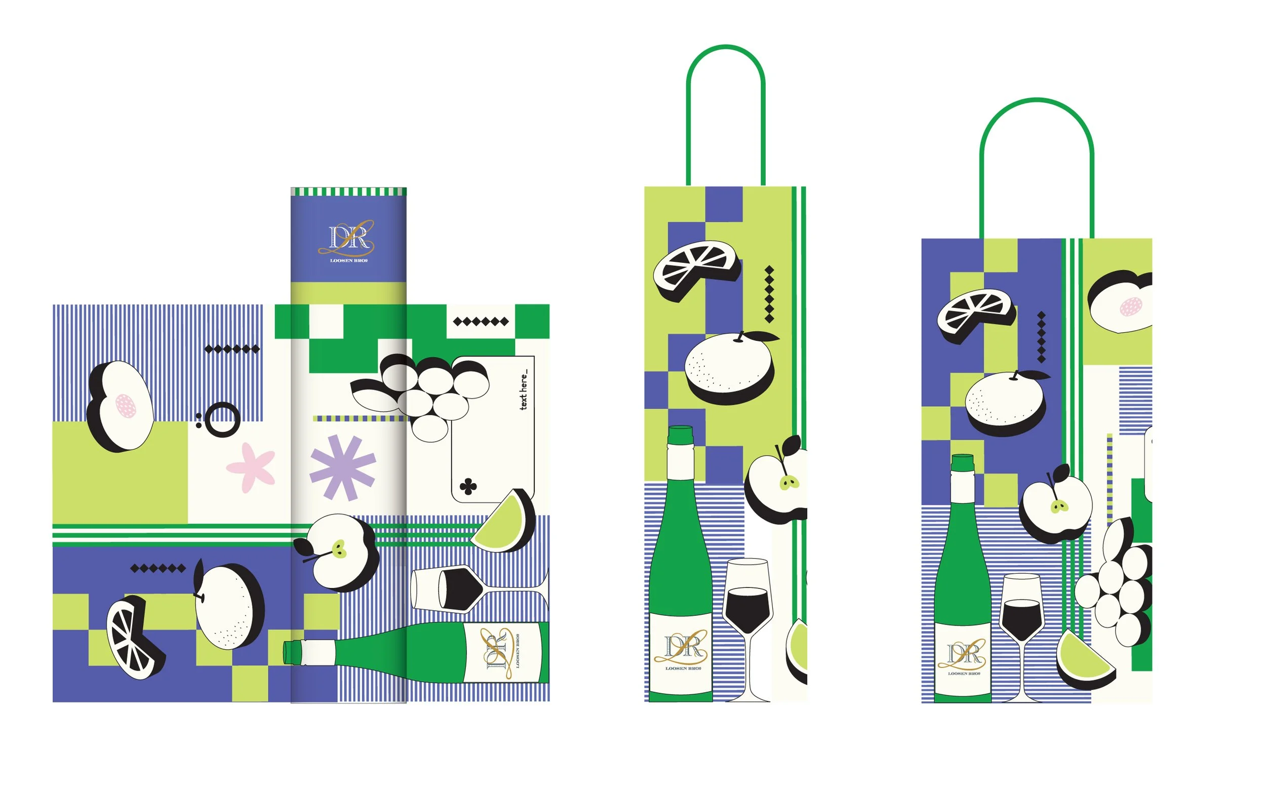
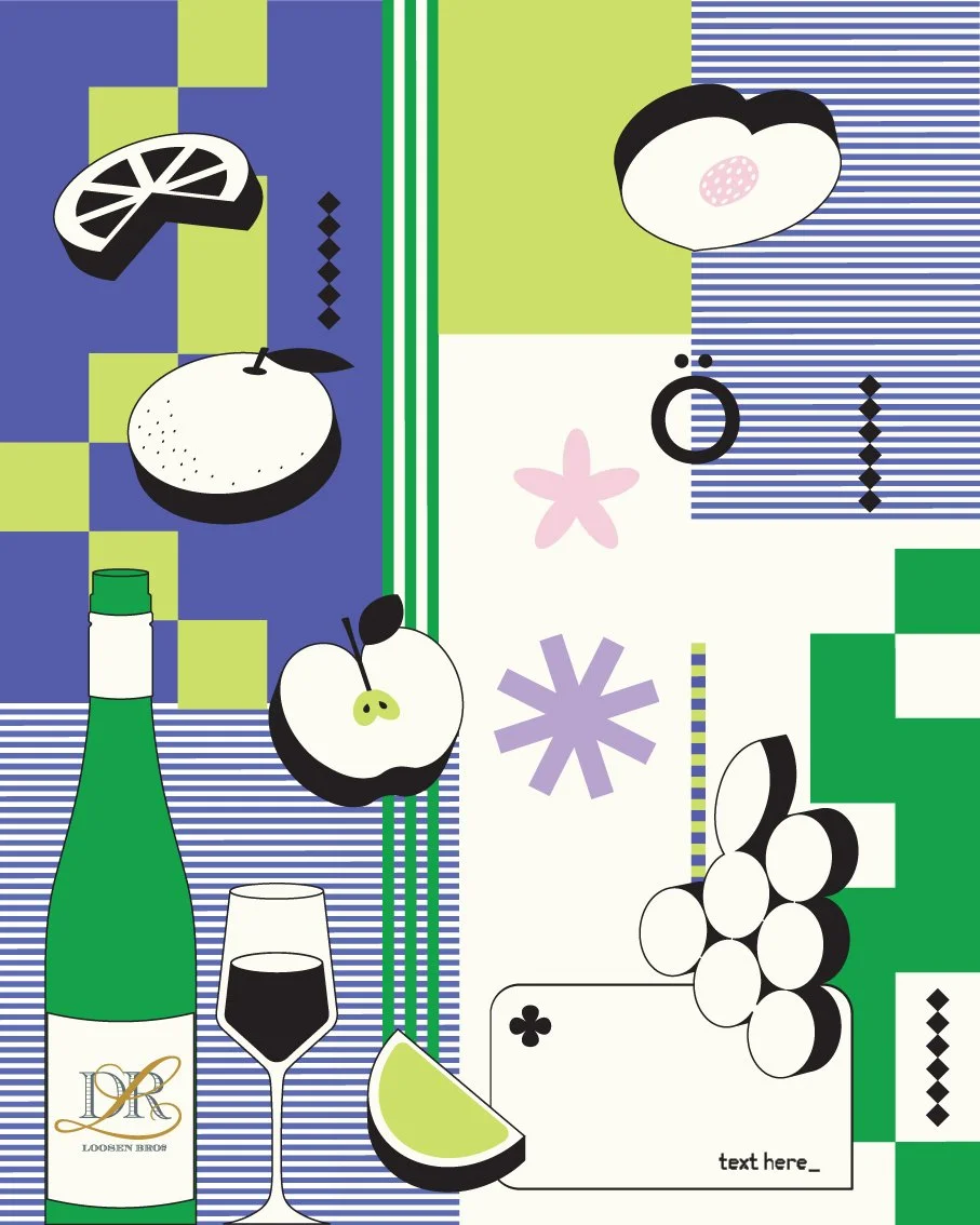
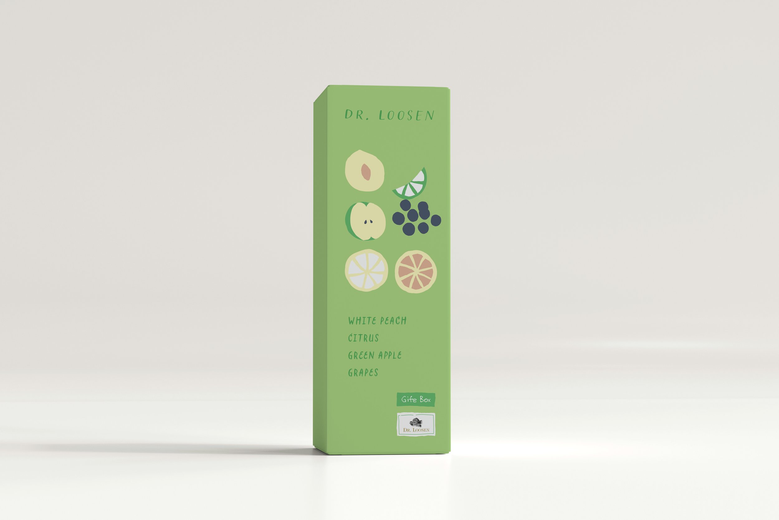
Dr. Loosen is a German winery with 200 years of history, its agent in China needs graphic designs for seasonal sales and promoting materials, which include Chinese New Year limited labels, visual merchandise design, and package design. This project is still ongoing, the packaging shown here is just finished for their upcoming sales in September. There were three concepts in total had been developed, at the very beginning the brand wanted the visual to be pop, flashy, and appealing to young generations, which led to the first design. However along with the process, they had decided they wanted something for more general purposes, and showcasing the brand essence, so the art direction went more and more elegant and minimalistic. But the theme of the illustrations was all the same, the winery's star product Riesling wine is very fruity and refreshing, it is easy to accept for anyone without much experience with wine, which made it popular among the young generation, so the theme of the illustration is always fruity. The last design was adopted by the client.
I think this project made me realise how important a good brief is, it needs to be clear what's the main purpose of the sales, and its target customers. Another issue with this brand is it doesn't have a brand book, there weren't many previous materials for references, no guidelines for colour or font usage. I had zero sources to learn about this brand. I had to initiate many conversations with the employee from the brand, digging up previous examples, and even discussing about the brand's philosophy and stories. In the end, it went well, all the people from the brand liked the design and think it represent the brand image in their minds. I also participated in the printing process, discussing with the print supplier directly to help with the packaging being produced.
Dr.Loosenは200年の歴史を持つドイツのワイナリーで、中国の代理店から、旧正月限定ラベル、包装デザイン、スーパーマーケットでの陳列計画など、季節ごとの販売促進用資料のグラフィックデザインを依頼されています。このプロジェクトはまだ進行中で、ここにあるパッケージは9月の販売に向けて完成したところです。コンセプトは全部で3つあり、当初はポップで派手、若い世代にアピールするビジュアルにしたいということを伝えられ、私は1つ目のデザインにしました。しかし、そのあとで、クライアントからより一般的な用途で、ブランドの本質を示すものが欲しいということになり、アートディレクションはどんどんエレガントでミニマルなものになっていました。ワイナリーの主力商品であるリースリングワインは、とてもフルーティで爽やかな味わいで、ワインにあまり馴染みのない人にも受け入れられやすく、若い世代にも人気があります。3番目のデザインはクライアントに採用されました。
このプロジェクトを通して、ブリーフの重要性を痛感しました。このブランドのもうひとつの問題は、ブランドブックがないことです。参考になる過去の資料があまりなく、色やフォントの使い方のガイドラインもありませんでした。このブランドについて知るための情報源はゼロでした。私はこのブランドの社員と何度も会話を始め、過去の事例を掘り起こし、さらにはブランドの哲学やストーリーについて議論しなければならなかったです。最終的には、ブランドの関係者全員がこのデザインを気に入り、彼らの心の中にあるブランド・イメージを表現できたと思います。その後印刷業者と直接話し合い、パッケージの印刷を手伝いました。
Concept 1

Concept 2


Concept 3


